
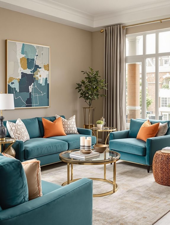
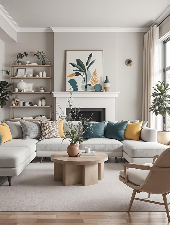
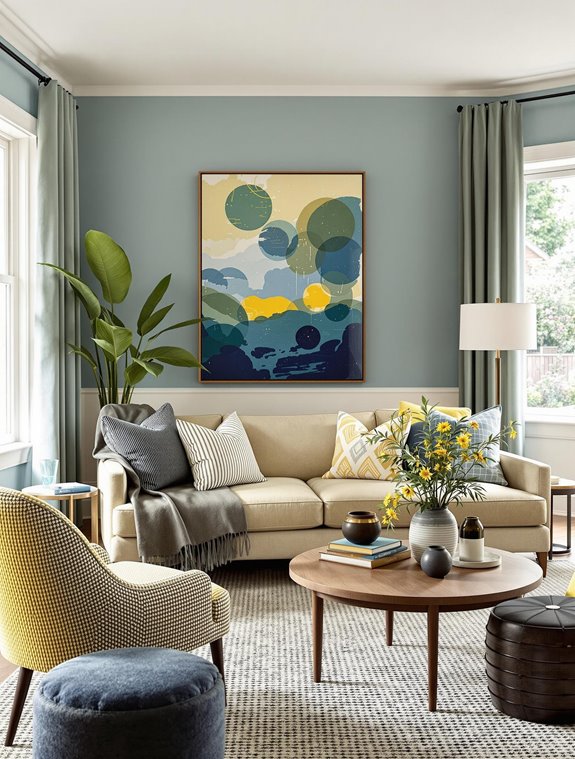
The color rule for living rooms is founded on the 60-30-10 principle, an essential guideline in interior design that orchestrates color distribution to guarantee a cohesive and harmonious aesthetic.
This rule assigns 60% of the room’s color to a dominant hue, often applied to walls and large furniture pieces, establishing the space’s fundamental ambiance.
A secondary color, occupying 30%, augments depth and contrast, enriching the visual narrative through window treatments and select furnishings.
The final 10% features accent hues, manifesting personality through decorative details like cushions and artwork. Strategic application of these elements can profoundly impact mood and perception.
Designing Keys
- The 60-30-10 rule is a guideline for balanced color schemes in living rooms.
- Allocate 60% for dominant color, 30% for secondary, and 10% for accent colors.
- Dominant colors set the primary ambiance, usually on walls and large furniture.
- Secondary colors add contrast and depth, applied to items like curtains and accent chairs.
- Accent colors provide personality, used sparingly in accessories like cushions and artwork.
Understanding the 60-30-10 Rule
The 60-30-10 rule is a foundational guideline in interior design that offers a simple yet effective way to create a balanced and aesthetically pleasing color scheme in living spaces.
This rule prescribes a strategic distribution of colors, guaranteeing harmony and cohesion through strategic color combinations and visual balance. By allocating 60% of the room’s color to a dominant shade, typically applied to walls, floors, and expansive furniture, the space achieves a cohesive and unifying backdrop.
This substantial color presence establishes the room’s primary ambiance, serving as the canvas for additional hues.
The secondary color, constituting 30% of the space, is typically used to add contrast and depth. It is often applied to upholstery, curtains, or bed linens, providing a complementary layer that enhances the dominant color while introducing visual dynamism.
The final 10% is reserved for accent colors, strategically placed through decorative elements such as throw pillows, artwork, and small decorative pieces.
Additionally, the 10% accent rule allows for personalization and dramatic design variations, ensuring that the space reflects the unique style of its inhabitants.
These accents act as focal points, injecting personality and interest into the room without overwhelming the senses. Through this meticulous allocation, the 60-30-10 rule guarantees an interior that is both visually appealing and architecturally harmonious.
Choosing Dominant Colors
When selecting a dominant color for a living room, how does one assure it effectively sets the desired mood and theme? The dominant color, occupying 60% of the room’s visual space, is essential for crafting the intended ambiance.
It should be applied to primary elements such as walls and major furniture pieces. Utilizing the 60-30-10 rule encourages harmony and cohesion in design, which helps in balancing visual weight in interior spaces.
Adhering to current color trends while honoring personal preferences guarantees the color resonates with both the homeowner’s style and contemporary design sensibilities. This balance is important, as the dominant color not only garners the initial attention upon entering the room but also dictates its overall aesthetic and mood.
The selection process involves several key criteria. The chosen color must reflect personal style, harmonize with existing decor, and leverage color psychology to evoke specific emotional responses—such as calmness with blue or cheerfulness with yellow.
Additionally, it is crucial to take into account the room’s size, using lighter shades to expand small spaces or darker tones for intimacy in larger areas. Practical considerations, like the effect of natural light through windows or the room’s purpose, also play a significant role in the decision-making process.
Ultimately, the dominant color should offer long-term appeal, maintaining a harmonious and balanced look throughout.
Using Secondary Colors

Having established the dominant color‘s role in setting the ambiance, attention now turns to the strategic use of secondary colors to enrich the living room’s palette.
Secondary color selection is pivotal, as it occupies 30% of the room’s visual space, supporting the dominant hue while introducing contrast and visual interest. This dual role guarantees that secondary colors complement and enhance the primary color, thereby preventing visual monotony. Understanding the impact of color psychology can aid in choosing secondary colors that evoke the desired mood and emotional response in the room’s occupants.
Often employed in elements such as window coverings, draperies, accent chairs, and painted furniture, secondary colors can also define an accent wall, further contributing to the room’s depth and balance.
In selecting secondary colors, one must verify they remain complementary to the dominant shade, often opting for hues adjacent on the color wheel to achieve an analogous scheme.
Alternatively, a triadic color combination might be chosen for a more balanced yet contrasting look. These colors should be distinct enough to stand apart yet harmonious enough to maintain the room’s aesthetic cohesion.
When applied to furniture, rugs, and other decorative elements, secondary colors greatly enhance the room’s ambiance, fostering a warm and inviting atmosphere while contributing to the overall psychological and aesthetic impact, thereby enriching the living room’s design.
Adding Accent Colors

Accent colors, comprising a mere 10% of the room’s color scheme, play an important role in elevating the living room’s aesthetic by adding personalization and flair. These colors, strategically used in decorative accessory selection such as lamps, cushions, and artwork, introduce elements of contrast and interest, transforming the space into a visually stimulating environment.
Accent color psychology suggests that these hues, which can include metallic finishes like gold or brass, should be chosen concerning the room’s architectural structure and intended use, ensuring they complement the primary and secondary colors and enhance the overall design narrative. By following the 60-30-10 rule, the main, secondary, and accent colors can be distributed to maintain a balanced and cohesive look.
When integrating accent colors, it is vital to strike a balance between these lively hues and the dominant color palette. Employing one or two accent colors, each occupying 5% of the room’s color scheme, can prevent the space from becoming overwhelming.
These colors should be applied sparingly yet effectively, featured in items like throw pillows, picture frames, and florals, to create focal points without overpowering the room. Additionally, varying shades and textures within these accents can provide additional depth and complexity, ensuring the living room maintains a sophisticated and harmonious appearance.
Considering Room Size and Light

As accent colors breathe life into a living room, understanding how room size and natural light affect color choices is equally important. In smaller spaces, employing light colors such as whites, tans, and light greens can enhance the perception of space by promoting light reflection, thereby making the room appear more expansive and open.
Light colors not only increase the dimensions but also contribute to a serene atmosphere by reflecting natural light effectively. Conversely, while dark colors can imbue a sense of intimacy and depth, they should be applied judiciously. A singular dark accent wall, perhaps in charcoal or deep blue, can create a striking color contrast without overwhelming the space, especially when balanced with lighter hues.
Natural light greatly impacts color dynamics within a living room. Maximizing light reflection through light-colored walls and furnishings enhances the room’s airy feel, while strategically placed mirrors can further amplify this effect.
In contrast, rooms with limited natural light benefit from using lighter main colors to compensate, supplemented by lively accent colors to introduce energy. Selecting neutral furniture allows walls and decor to define the color scheme, highlighting the careful consideration of room size and light.
Exploring Color Psychology
Color psychology plays an essential role in crafting the atmosphere of a living room, influencing both mood and perception. Understanding color associations and their corresponding emotional responses can guide effective design choices.
For instance, happy and energizing colors such as yellow, orange, and red are often linked with positivity, energy, and joy. Yellow, in particular, imparts a playful and mood-boosting quality, while orange fosters a lively ambiance, and red exudes passion and strength. Warm yellows, such as pale golds and rich wheat tones, create a cozy, inviting environment, enriching the living room’s overall warmth.
In contrast, relaxing and calming colors like blue and green evoke serenity and harmony. Blue’s association with calmness and relaxation is ideal for crafting a tranquil living space, while green suggests harmony and safety. Soft blues can lend a carefree feel to the room, and combining beige and blue results in a balanced, soothing palette.
Sage green, when paired with golden yellow, achieves a dynamic yet calming aesthetic. By understanding these color associations, homeowners can manipulate emotional responses, ensuring their living rooms not only reflect personal style but also promote desired moods and atmospheres. Harmonious color selection enhances comfort and invites positivity, making it crucial to choose colors that align with the desired atmosphere for each space.
Frequently Asked Questions
How Do I Incorporate Patterns While Following the 60-30-10 Rule?
To incorporate patterns while adhering to the 60-30-10 rule, focus on pattern mixing by balancing scale and ensuring color balance. Use patterns strategically in accent items, aligning them with dominant and secondary colors for cohesive harmony.
Can the 60-30-10 Rule Be Applied to Open-Concept Living Spaces?
According to a recent survey, 75% of interior designers recommend the 60-30-10 rule for ensuring color balance in open spaces. This approach facilitates harmonious shifts between areas, enhancing aesthetic continuity while accommodating open-concept functionality.
How Often Should I Update My Living Room Color Scheme?
To maintain an appealing living room, reassess your color scheme every 3-5 years, considering color psychology and current color trends. This guarantees alignment with personal taste and lifestyle changes, while incorporating fresh and timeless design elements.
What Tools Can Help Visualize My Color Scheme Before Committing?
Commence a creative journey with innovative visualization tools like ColorSnap® Visualizer, Coolors.co, and Glidden Room Visualizer. These platforms offer exquisite color palette options, enabling you to imagine your living space’s transformation before making definitive choices.
How Do I Incorporate Seasonal Decor Within the 60-30-10 Framework?
Incorporating seasonal decor within the 60-30-10 framework involves integrating seasonal hues through decor shifts. Gradually replace accent pieces, like pillows and vases, to reflect seasonal changes, ensuring harmony with the dominant and secondary colors for balanced aesthetics.
Wrapping up
Coincidentally aligning with the principles of architectural harmony, the 60-30-10 color rule establishes a cohesive framework for living room design, ensuring visual balance and aesthetic appeal. Dominant colors, occupying 60% of the space, set the foundational tone, while secondary colors, at 30%, provide depth and contrast. Accent colors, limited to 10%, introduce vibrancy and focal points. Considerations of room size and natural light further inform color choices, while color psychology subtly influences mood and perception, culminating in a thoughtfully curated environment.


