Bold colors are storming back into home design, breathing life and passion into our everyday spaces. Envision replacing that drab beige with a confident cobalt blue or seductive scarlet, suddenly your living room becomes a canvas of your wildest whims. Social media platforms like Instagram shout "Yes!" to creative experimentation, transforming bold hues into global design phenoms. From earthy 70s nostalgia to moody noirs and joyful shades that spark dopamine, these palettes have personality. They're masterful storytellers, weaving warmth and energy into interiors. If your curiosity piqued, there's more color magic waiting just around the corner.
Designing Keys
- Bold colors now serve as neutrals in interior design, creating vibrant spaces.
- Social media accelerates bold color trends, making them accessible globally.
- Nostalgic warm hues add emotional depth and comfort to interiors.
- Two-tone schemes with dark colors enhance visual depth and moodiness.
- Jovial colors promote joy, balanced with moderation for timeless appeal.
Bold Hues as Neutrals
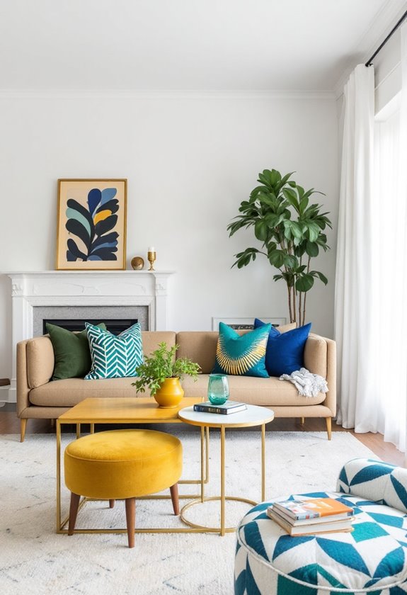
In the domain of interior design, the concept of employing bold hues as neutrals has gained considerable traction. Bold color psychology plays a significant role in this trend, as the emotional responses to color impact the overall ambiance of a space. The strategic use of a bold-colored sofa in an otherwise neutral setting, for instance, can create a focal point that invigorates the room's aesthetic.
Moreover, integrating multi-colored art or patterns can greatly enhance the cohesiveness and visual appeal of the space. Achieving accent color harmony requires a delicate balance between bold hues and neutral tones. The neutral base offers a canvas upon which the bold accents can genuinely shine without overwhelming the senses. It provides a platform for visual continuity, with the bold hues adding depth and dimension through patterns and textures.
Choosing the right bold color is essential. The largest pattern in the space often influences this decision, with the chosen hue serving to unify the design elements. Following the 60-30-10 rule, bold colors are introduced in a controlled and pleasing manner, contributing to the overall satisfaction with the design. But remember, overuse of bold color schemes can potentially lead to a sense of visual overwhelm, so it's important to use them sparingly and strategically (overwhelming if overused).
Managing bold patterns can be an art in itself. With careful color blocking and attention to scale, these patterns can coexist harmoniously within a space, providing a visually engaging yet comfortable environment.
Social Media's Color Influence
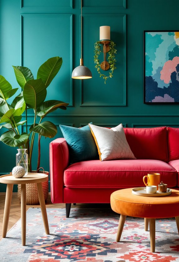
As we explore the bold colors impact in home design, it's impossible to ignore the influence of social media in shaping this trend. Platforms like Pinterest and Instagram have become modern-day inspiration boards, driving users to experiment with lively hues. The visual appeal of posts often showcases a wide range of color options, from earth tones to bright hues, stimulating users to incorporate these into their designs.
Social media's real-time nature accelerates trend forecasting, rapidly globalizing niche trends, such as bold colors in homes. With the rise of eco-conscious campaigns and the popularity of upcycled furniture, there's also been a noticeable shift towards bolder, more vibrant colors in sustainable home decor items. The immediate feedback helps in identifying and adapting to color trends as preferences evolve. Influencers and designers greatly impact these trends, promoting specific colors and styles, thereby influencing public preferences.
Additionally, technology plays an essential role. Augmented reality features offer virtual room tours, enabling users to visualize bold colors in their space, making color choices less intimidating. DIY videos provide step-by-step guides, making the process more accessible.
Finally, social media analytics, a key tool in color psychology, tracks which color trends resonate most, shaping future design decisions. The use of eco-conscious campaigns and sustainable materials in bold colors, as seen on social media, further encourages users to make environmentally friendly choices while experimenting with their home decor.
Rise of Dark, Moody Colors

Tapping into a rich visual narrative, the design world is witnessing the rise of dark, moody colors. This trend, inspired by elements of film noir and Gothic architecture, combines the depth of dark hues with the intrigue of moody textures to evoke a sense of intimate coziness.
Searches for "moody living room" and "moody kitchen" designs have more than doubled in the last year, reflecting a growing desire for spaces that are not just visually stunning, but also profoundly personal.
These moody hues, ranging from deep blues to charcoal gray, are often paired with rich materials like velvet, leather, and dark wood. Metallic accents such as brass or gold are used to create a contrast, adding a touch of shine and interest.
For balance, light-colored accents are used to avoid overwhelming the space. The trend also embraces the use of patterns, with dark florals and geometric prints serving as a popular choice to amplify the aesthetics (patterns).
The versatility of this trend is clear, as it can be incorporated into various rooms. From living rooms with plush velvet sofas and dark curtains to dining rooms with deep shades of blue or green, the rise of dark, moody colors is genuinely transforming home design.
Exploring Two-Tone Schemes
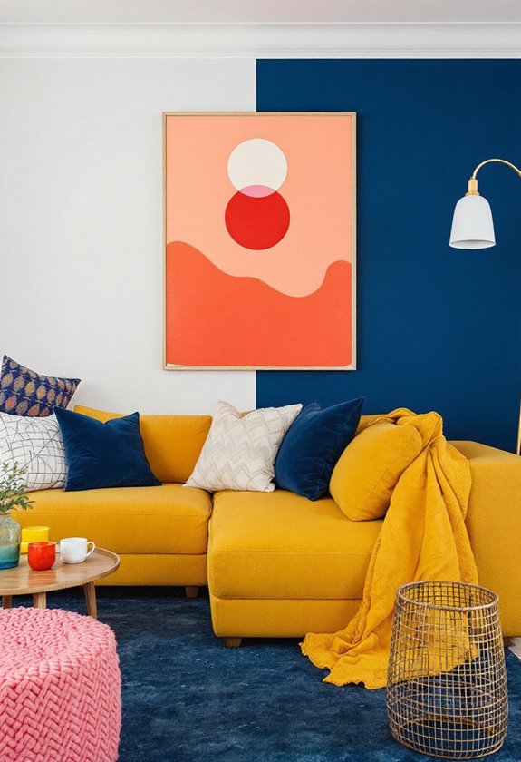
Diving into the world of two-tone schemes, one finds a unique way to add visual interest and depth to a space. Combining light and dark shades, two-tone walls create a striking illusion of height and draw focus to specific areas of a room. This design technique can be practical, hiding marks on the darker shade, while adding dimension to otherwise flat surfaces.
Two-tone accessories, such as monochromatic pillows, striped rugs, and metallic accents, also play an important role in this scheme. These additions are not only cost-effective but also offer a chic method for incorporating this trend without committing to a full wall repaint. Indeed, one can even foster a serene atmosphere with two-tone neutrals, creating a calming backdrop against more vibrant furniture pieces (calming backdrop).
Rooms, from dining areas to home offices, can benefit from this design versatility. Subtle hues in workspaces promote focus, while bold combinations in dining rooms foster sophistication. In children's bedrooms, lively two-tone walls can easily mask handprints or marks, proving both stylish and functional.
Successful two-tone schemes require a keen eye for color cohesion and balance. It's vital to guarantee both shades blend seamlessly and don't overwhelm the space.
Whether applied internally or externally, two-tone schemes can genuinely transform a space, creating intriguing dimensional walls and adding a touch of boldness to home design.
Embracing Jovial Colors
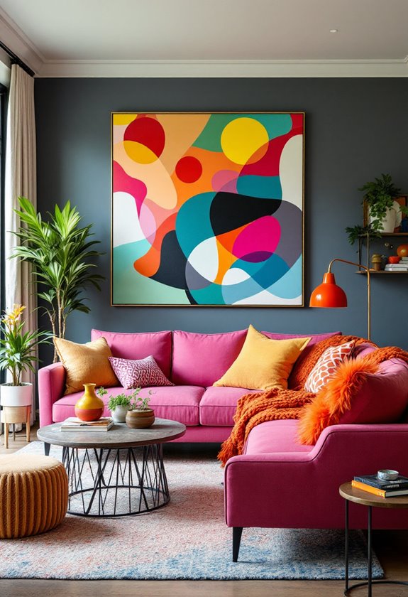
In the domain of interior design, the acceptance of jovial colors can add a fun, energetic dimension to any space.
These lively shades, such as bubblegum pink or bright turquoise, are a reflection of the power of color psychology. They evoke feelings of joy, optimism, and excitement, infusing the room with a sense of energy.
Incorporating these playful accents can be achieved through statement pieces, textiles, and art, each contributing to a spirited, engaging atmosphere. An accent wall in a jovial color can serve as a stunning focal point.
Similarly, textiles like pillows or rugs can add a pop of color without overwhelming the space.
Moreover, the 2024 color trend includes shades like Cracked Pepper, Renew Blue, and Persimmon, emphasizing individual style and personality in interior spaces (Bold and Expressive Colour Schemes).
The use of these colors aligns with contemporary trends such as the dopamine décor movement, which emphasizes the creation of spaces that trigger happiness.
Despite their bold nature, jovial colors can be integrated with other shades to maintain a timeless appeal, providing a balance between liveliness and elegance.
Nostalgia Through Sophisticated Hues
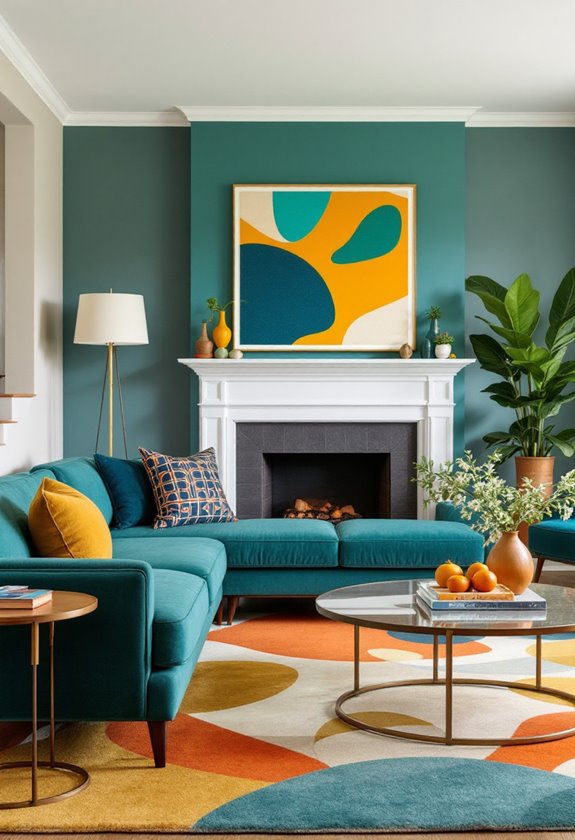
While jovial colors inject energy and joy into a space, another intriguing palette has emerged in the domain of interior design: nostalgia through sophisticated hues. This trend leverages vintage paint colors like warm earthy browns, rusty oranges, and mellow 'dirty' greens and blues, offering comfort and grounding in their familiar warmth.
Retro shades originating in the 1970s, like mustard yellows and terracotta, are witnessing a robust comeback, enhancing spaces with their cozy undertones. Pairing these nostalgic hues with vintage-style wallpapers, metallic tile finishes, or velvet upholstery enhances the emotional connections to the past, creating a luxurious, yet nostalgic decor.
These sophisticated nostalgic colors also serve a deeper purpose: they connect us to our life stories, providing comfort in the known and familiar. They can conjure specific moments and places from the past, acting as a time machine in home decorating. Additionally, the 2025 color palette is expected to emphasize even more of such warm and cozy colors, further enhancing this trend (2025 palette).
This psychological impact, coupled with the ability to create balance and sophistication in the overall design, makes the nostalgia trend more than just a fad. It's a reflection of the enduring appeal of nostalgic materials and the human desire for warmth, safety, and emotional connection.
The Parisian Gray Trend
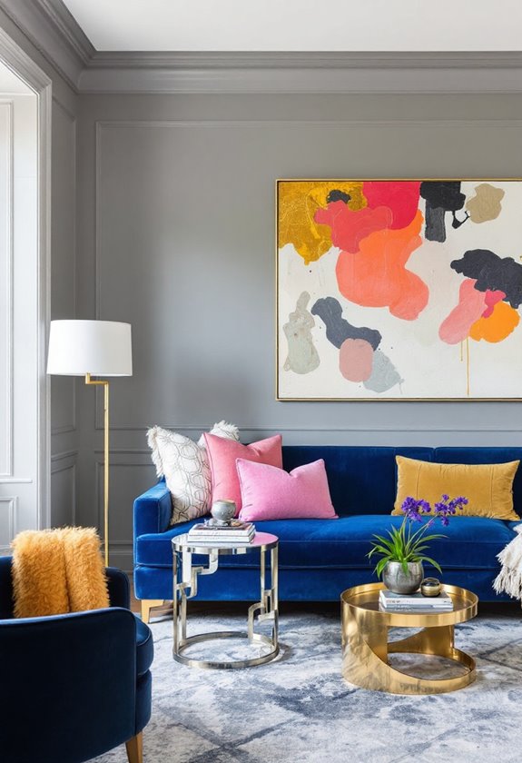
Despite a shift towards warmer colors in interior design, the Parisian Gray trend continues to hold its ground, albeit with subtle transformations. The gray versatility remains undisputed; it can be incorporated into secondary rooms or accent walls, adding a touch of sophistication without overwhelming the space.
The trend is moving away from cooler, dominant shades to warmer, subtle shades of gray. These are more appealing, especially in bright, well-lit spaces. They can be combined with white or other neutrals for a harmonious palette, or paired with rich brown tones for an elegant look.
The textured combinations are one of the key aspects of the Parisian Gray trend. Heavily textured walls or fabrics introduce a tactile richness, creating a rich, layered look. This is particularly effective when combined with sleek gray surfaces. The dynamic shadows created by these varying textures bring a unique sophistication to the space.
Using Parisian Gray in moderation can create a striking balance. Painting kitchen islands, bathroom vanities, or using it on specific furniture can strike the right balance, making this timeless color a versatile choice in contemporary home design. The right furniture pieces, such as dark gray upholstered chairs or brown leather sofas, can skillfully blend modern and timeless styles, further enhancing the Parisian Gray trend (classic Parisian furniture).
The Warm Appeal of Red
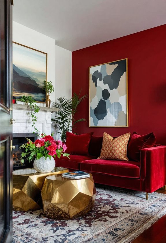
As the Parisian Gray trend evolves with sophisticated subtleties, a different spectrum of color, red, asserts its presence in contemporary home design. At the core of red psychology is its electrifying ability to evoke passion, energy, and ambition. Embracing red isn't just about aesthetics; it's about injecting a dynamic pulse into every corner of your home.
Consider red accents—a bold lacquered cabinet or a dramatic accent wall—to infuse spaces with lively vivacity. In accordance with the Unexpected Red Theory, incorporating small yet striking elements of red can significantly uplift mundane spaces, creating a design that's both bold and aesthetically pleasing.
In home environments, red can manifest uniquely in every room, from invigorating kitchens to comforting snugs. Picture a cozy library swathed in rich, earthy reds; it invites you to lose track of time among the pages.
Or envision a spirited home office where the walls' deep hue fuels creativity and focus. The key is balance; red's boldness can overpower if overdone. Thus, incorporating red accents through fabrics or bookshelf backs offers a significant yet subtle impact.
Red has a flair for diversity, whether playing anchor roles in interior accents or adding drama with patterned wallpapers. The secret lies in juxtaposing red with neutrals—watch how crimson sings against whispering whites and striking blacks.
Always remember: when in doubt, test!
People are Asking
How Can Bold Colors Affect the Resale Value of a Home?
Bold colors can influence a home's resale value through color psychology and market trends. Strategic choices, like incorporating certain grays or blues, can increase offers, while undesirable hues like bright yellow may negatively impact perceived value.
What Are Some Easy DIY Projects to Integrate Bold Colors?
For those seeking effortless DIY projects, consider using color mixing techniques to paint accent walls. This approach creates personalized spaces with minimal effort. Additionally, revamping furniture with bold colors can introduce vibrancy and modernity into any room.
How Do You Transition From a Neutral Palette to Bold Colors?
Changing from a neutral palette to bold colors involves understanding color psychology, employing contrast techniques, and balancing with neutrals. Gradual introduction via impactful accessories, strategic wall colors, and cohesive design elements guarantees a seamless, visually appealing transformation.
Are There Bold Color Options That Are Eco-Friendly?
Certainly, bold color options that are eco-friendly are available through sustainable pigments and eco-friendly finishes. These options offer lively hues derived from natural minerals, enhancing interior aesthetics while promoting healthier indoor air quality and environmental responsibility.
What Accessories Complement Bold Colors in Interior Design?
Envision a lively room where strategically chosen accessories create harmony through clever color combinations. Paintings, cushions, and rugs in complementary hues, balanced with subtler tones, craft an inviting space, enhancing both boldness and coherence in accessory choices.
Wrapping up
Ironically, the resurgence of bold colors in home design suggests a rebellion against minimalism despite the persistent dominance of neutral palettes. Social media's influence, with its lively feeds, plays a significant role in this bold color revival, perhaps igniting a modern renaissance of dark, moody ambiances. Curiously, two-tone schemes and jovial hues prompt nostalgic reflections, offering a sophisticated tribute to the past. Meanwhile, the Parisian gray trend and red's warm allure subtly challenge the tyranny of beige.


