
Mixing patterns in your living room decor is like throwing a fabulous dinner party—there's a delightful chaos, but finesse is key! Start by finding an inspiring piece; it'll be your decor's charming host. Remember to balance large patterns with smaller ones for that sweet visual harmony. Aim for a playful mix, but keep it at least 60% solid to keep things grounded—because too much excitement may lead to dizzy guests (or eyes). Infuse textures and complementary colors, letting your personality shine through. With a sprinkle of humor and creativity, your space can become a joyous mosaic—there's always more to explore!
Briefly keys
- Choose an inspiration piece to guide your color and pattern selections, ensuring it resonates with your desired style.
- Mix large-scale patterns with smaller ones to create contrast while maintaining a harmonious ratio of bold to subtle elements.
- Layer different textures and materials to enhance visual interest while keeping a cohesive color scheme throughout the decor.
- Maintain a balance of 10% bold patterns, 30% supporting patterns, and 60% solids for an aesthetically pleasing look.
- Incorporate natural elements, like plants, to add dynamism and break up the patterns in your living room.
Understanding Balance and Harmony
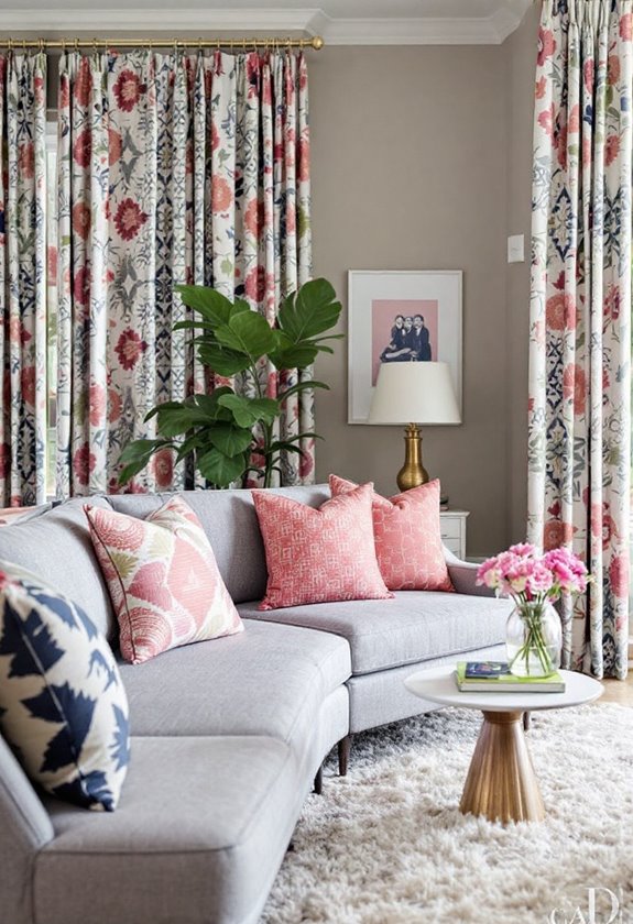
Achieving balance and harmony in living room decor is essential for creating a visually pleasing and cohesive space. When it comes to mixing patterns, contrast balance is your best friend. Pairing large-scale patterns with smaller ones can keep the design from spiraling into chaos—think of it like pairing a bold statement necklace with a delicate blouse.
Aim for a harmonious ratio that avoids a 50/50 split; after all, no one wants a fashion faux pas in their living room! Symmetry arrangements can lend a sense of order, especially with matching chairs or lamps, creating a central focal point. But don't be afraid to welcome asymmetry, as it adds that delightful twist of visual intrigue—like an unexpected plot twist in your favorite novel!
Remember, visual weight matters; it's all about proportion and balancing those dramatic pieces with subtle accents. Symmetry contributes to order and let's not forget color—select shades that unify your patterns, ensuring they play nicely together. Light hues can expand the room while darker tones wrap it in warmth.
Selecting Your Inspiration Piece
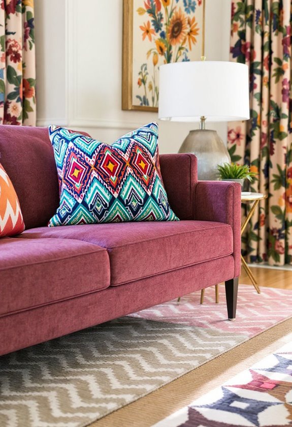
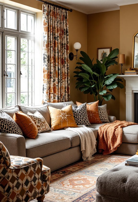
Selecting an inspiration piece is a crucial step in establishing the overall aesthetic of your living room decor. This focal point serves as the anchor around which your entire design revolves. Envision a bold, patterned sofa or an exquisite area rug that captures your heart—this is your statement piece. Its lively colors and textures will guide your selections, ensuring a harmonious blend of patterns.
When choosing your inspiration piece, look for a pattern that resonates with you and reflects the room's intended style. A diverse palette within this pattern will help you pull in complementary colors for pillows, curtains, and accessories. Incorporating earthy tones can create a warm and inviting atmosphere, enhancing the overall comfort of the space.
Just remember, a little contrast goes a long way; mixing scales and textures can add that delightful visual intrigue without overwhelming the senses. Picture a large floral print paired with smaller geometric shapes—it's like a dance between bold and subtle.
And let's not forget the importance of neutral colors as a calming influence, allowing your statement piece to shine.
Mastering Monochromatic Mixing
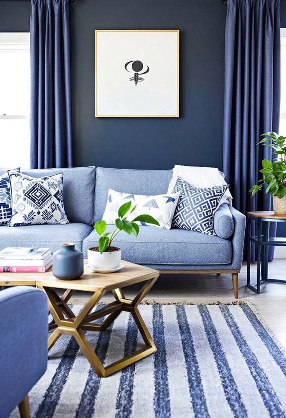
Monochromatic mixing offers a sophisticated approach to living room decor, allowing for a seamless blend of shades, tints, and tones derived from a single color. Envision wrapping your space in the soft hug of a serene blue, where each hue whispers its own story.
This technique is all about monochromatic layering—think of it as your color's family reunion, where every relative contributes something unique while still sharing the same DNA. Architectural features such as skirting boards and mantelpieces can enhance the visual interest of your monochromatic design.
To keep things lively, introduce texture variety. It's like dressing your color in different fabrics; a cozy knitted throw here, a sleek rattan chair there. This interplay of textures not only adds depth but also invites touch, making your living room a tactile wonderland.
Don't forget the power of black and white accents to sharpen your scheme, adding that much-needed visual punch.
Add in natural elements, like a lively green plant, and suddenly, your space feels dynamic yet cohesive.
Exploring Pattern Scale Variation

When it comes to living room decor, understanding pattern scale variation can greatly elevate your design aesthetic. Imagine this: a large, bold floral sofa paired with delicate, tiny polka dot cushions. This delightful contrast, governed by scale principles, not only keeps things visually interesting but also prevents chaos from spiraling out of control.
To create a cohesive pattern hierarchy, select a single large-scale 'hero' pattern—perhaps a statement rug or a striking piece of art. This hero should dominate the scene, allowing smaller patterns to play supportive roles without vying for attention.
Remember, balance is essential; allocate roughly 10% for bold patterns, 30% for supporting patterns, and a generous 60% for coordinating solids. This guarantees each pattern has room to breathe, avoiding the dreaded "hot mess" look. Additionally, mixing patterns can enhance the overall style and aesthetic appeal of your living space.
Mixing pattern types—like geometric and floral—adds depth, but be mindful of color coordination to maintain cohesion. After all, nobody wants their living room to resemble a circus tent!
Engage your eye at different levels and vantage points, and before you know it, your living room will be a symphony of style, harmony, and delightful surprises.
Connecting Colors and Textures
Creating a harmonious living space often hinges on the successful connection of colors and textures. Envision entering a room where the colors beckon and the textures dance—this is the essence of effective color coordination and texture layering.
Begin with a cohesive color scheme; think of it as the glue that binds your eclectic pieces. Select at least one color from each pattern to create a common thread throughout the room.
Now, let's talk texture. Layering different materials, like the inviting softness of velvet against the cool sleekness of metal, adds that delightful depth we crave. Mixing smooth and rough surfaces creates pleasing contrasts that enhance the overall aesthetic.
Don't shy away from mixing natural textures, such as rustic wood with smooth glass—it's a recipe for visual intrigue!
And remember, even a bold color can be tamed with a neutral backdrop, preventing your living room from looking like a carnival gone rogue. Solid-colored elements can act like the adult supervision in your décor, ensuring everything plays nicely together.
People are Asking
How Do I Choose a Pattern for My Furniture?
When selecting patterns for your furniture, consider the materials and their inherent qualities, alongside color psychology. Harmonizing patterns with the space's overall theme enhances aesthetic appeal, while evoking desired emotional responses through strategic color choices.
Can I Mix Patterns in Small Spaces Effectively?
Yes, mixing patterns in small spaces can be effective by employing small space strategies that prioritize pattern balance. Utilize a mix of scales and textures, ensuring larger patterns are complemented by smaller ones to create visual harmony.
What Patterns Work Best for a Minimalist Style?
For a minimalist style, incorporate minimalist stripes and subtle geometrics to maintain a clean aesthetic. These patterns complement each other, offering depth and interest without overwhelming the space, thereby fostering a tranquil environment.
How Can I Incorporate Patterns in Artwork?
Incorporating patterns in artwork requires careful consideration of artistic balance and color harmony. Utilizing repetitive shapes, contrasting geometric and organic designs, and drawing inspiration from nature can enhance visual interest and create cohesive compositions.
Are There Specific Rules for Mixing Patterns in Outdoor Spaces?
When mixing patterns in outdoor spaces, prioritize color harmony across outdoor textiles. Choose complementary patterns and textures that resonate with the natural environment, ensuring a cohesive aesthetic while enhancing comfort and visual appeal in the area.
Wrapping up
In the art of living room decor, successful mixing of patterns embodies the delicate dance of balance and harmony, akin to a symphony where each note contributes to a greater melody. The thoughtful selection of colors, textures, and scales creates a visual narrative that resonates with the soul, transforming a mere space into a sanctuary. Consequently, embracing the nuances of pattern mixing not only elevates aesthetics but also fosters a sense of belonging, echoing the warmth of home.


