
Incorporating lively colors in kitchen design can profoundly alter both ambiance and functionality, transcending the traditional white and gray. Warm tones such as red and orange invigorate spaces, stimulating appetite and energy, while cool hues like green and blue introduce calmness and serenity.
Small kitchens benefit from lighter shades to enhance spaciousness, whereas larger kitchens can accommodate rich, bold colors to create depth and warmth. Utilizing color theory, such as complementary and analogous schemes, can add visual contrast or harmony.
For those seeking uniqueness, mixing jewel tones with earthy elements revitalizes kitchens. Explore these principles to elevate your kitchen’s charm.
Designing Keys
- Incorporate bold colors like red or blue as accents to add character without overwhelming the kitchen space.
- Use complementary color palettes to create striking visual contrast and enhance kitchen aesthetics.
- Experiment with jewel tones for a luxurious, elegant feel in larger kitchen spaces.
- Select warm colors like yellow or orange to create a cozy, inviting kitchen atmosphere.
- Integrate unique features like colorful cabinetry or decorative accents to personalize and enhance kitchen design.
Understanding Color Psychology
Understanding color psychology is crucial in kitchen design, as the choice of colors can greatly influence the atmosphere and functionality of the space.
Color associations, deeply rooted in human psychology, evoke specific emotional responses, which designers must consider to optimize the kitchen’s ambiance and utility.
Warm colors such as red, yellow, and orange are known for their ability to stimulate appetite and enhance energy levels.
Red, while exciting and passion-inducing, can be overwhelming if overused, making it best suited for accents or feature walls.
Yellow and orange, on the other hand, create a cozy and inviting atmosphere; yellow enhances mood and is ideal for family gatherings, while orange symbolizes liveliness and health.
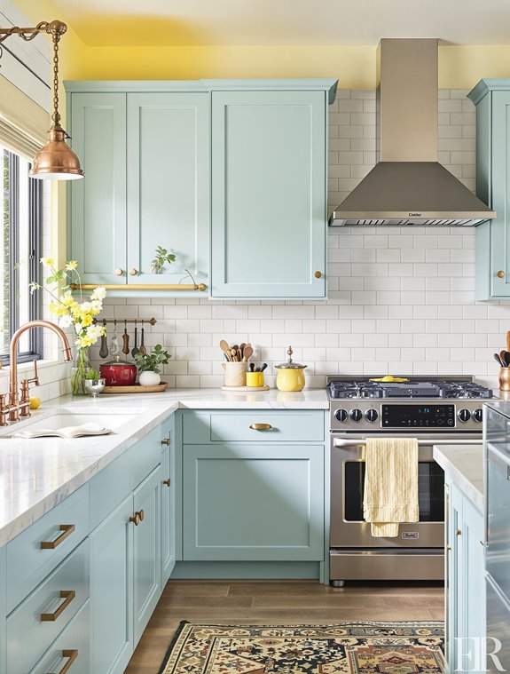
Conversely, cool colors like green and blue evoke a sense of calm and tranquility.
Green is associated with nature and health, promoting harmony and more mindful eating choices.
Blue, known for its stress-reducing properties, can help individuals relax and savor their meals, though it may suppress appetite.
Neutral and earth tones, such as white, brown, and terracotta, provide a clean, timeless look, balancing lively colors to avoid overwhelming effects, thereby ensuring a cohesive and aesthetically pleasing kitchen design.
Choosing colors based on kitchen dimensions and layout can further enhance the space, making it either more intimate or expansive depending on the desired effect.
Considering Kitchen Size

When designing a kitchen, the size of the space plays a pivotal role in determining the most suitable color palette. Small kitchen strategies often involve utilizing light colors, such as white or pale gray, which are adept at reflecting light and creating an illusion of spaciousness. By visually expanding the area, these shades prevent the room from feeling cramped, a common pitfall of darker hues.
Pairing light gray cabinetry with white walls is a prevalent choice in these environments, providing a cohesive, open feel, while warm wood accents can introduce balance and prevent the scheme from appearing too sterile. Textured neutrals can also be employed to create a luxe appearance in small kitchens, enhancing the overall aesthetic.
In contrast, large kitchen options allow for a broader range of colors, accommodating both light and dark tones according to the desired ambiance. Dark shades can impart a sense of coziness in expansive spaces, while bold colors like blue, green, or red can inject character and warmth.
For those preferring a timeless aesthetic, neutral tones such as beige, gray, and white maintain an open atmosphere. Incorporating natural materials like wood or stone alongside warm neutrals enhances the aesthetic appeal, creating a harmonious and inviting kitchen environment that complements the generous dimensions of the space.
Utilizing Natural Light
In kitchen design, the consideration of space size naturally leads to the importance of natural light, a vital element in creating an appealing and functional environment.
Optimizing natural light requires a thorough evaluation of existing light sources, such as windows, doors, and other openings, analyzing their direction and intensity throughout the day. This evaluation enables designers to identify areas within the kitchen that necessitate additional illumination, particularly for essential tasks like cooking, dining, and cleaning. Seasonal variations in natural light availability must also be considered to guarantee consistent lighting year-round.
To enhance natural light optimization, incorporating larger windows—such as floor-to-ceiling options—dramatically increases light influx, while selecting window styles like casement or picture windows, and installing skylights, further augments light entry. Utilizing transom and clerestory windows can also improve light quality, especially in kitchens with limited wall space.
Doors also play a pivotal role; utilizing glass doors, such as French or sliding glass options, fosters a seamless connection between indoor and outdoor spaces, while open floor plans promote light flow throughout the kitchen.
Reflective surfaces, including light-colored walls, cabinets, and countertops, as well as metallic finishes and mirrors, are instrumental in maximizing light reflection, effectively dispersing natural light throughout the space for an illuminated and lively kitchen environment.
Expanding the Color Palette
Expanding the color palette in kitchen design can greatly enhance the atmosphere and functionality of the space. Implementing principles of color theory and color mixing allows designers to craft visually engaging environments that harmonize with the home’s architecture.
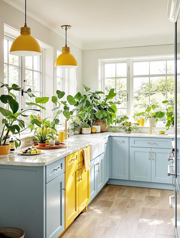
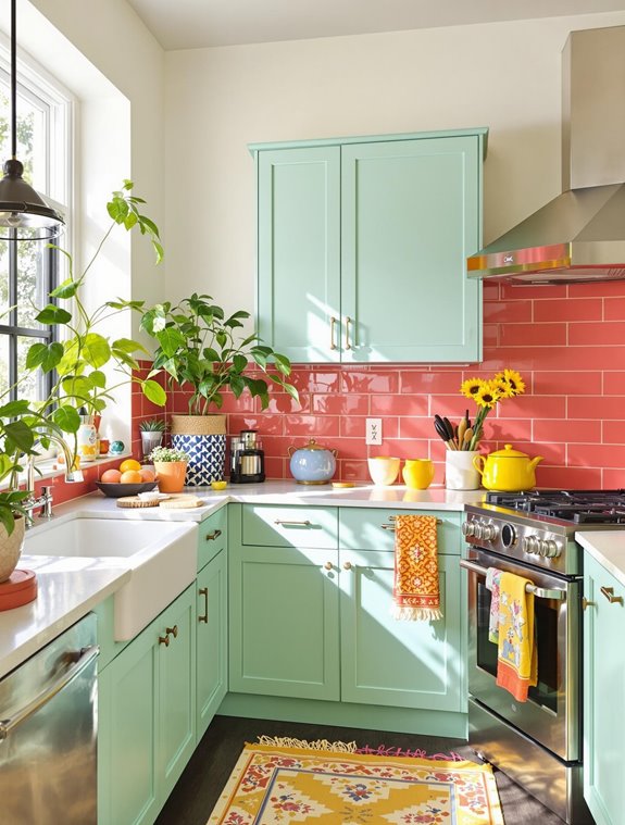
By selecting complementary colors, such as blue and orange, one can achieve striking visual contrast, enhancing the kitchen’s dynamic appeal. Alternatively, analogous colors, like shades of blue and green, offer a soothing, cohesive look, creating a seamless flow throughout the space.
Triadic color schemes, involving colors like blue, yellow, and red, introduce balanced energy and liveliness. Natural light plays a crucial role in color perception, with south-facing kitchens handling bold colors well and north-facing ones benefiting from lighter shades to brighten limited light.
Incorporating color into specific kitchen elements can further define and personalize the space. Cabinets can benefit from trending hues such as forest green and cashmere, offering a sophisticated departure from traditional choices.
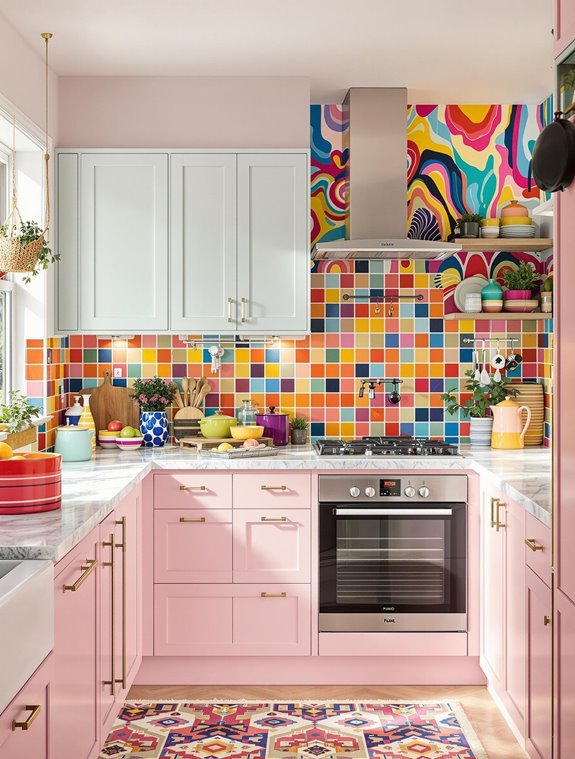
Meanwhile, lively backsplashes utilizing colors like aqua or coral can serve as focal points, infusing personality. Mixing cabinet hardware colors or opting for rich unlacquered brass against dark charcoal adds a sophisticated touch.
Balancing these elements is essential to maintaining harmony. Pairing bold colors with neutral tones guarantees visual contrast without overwhelming, while using lighter shades opens and brightens the space.
Ultimately, the expanded palette should reflect personal style, securing a space that is both unique and inviting.
Adding Bold and Trendy Colors
Bold and trendy colors play an instrumental role in revolutionizing kitchen aesthetics, offering a lively twist on traditional design. Embracing bold cabinet choices can transform kitchen spaces by injecting brilliance and character.
Color influences mood and ambiance in kitchen spaces; warm colors stimulate appetite while cool colors promote calmness. Opting for a lively color palette, such as Benjamin Moore’s New Lime, on lower cabinets or a kitchen island, against neutral-colored walls and trims, guarantees a harmonious yet striking appearance.
Alternatively, dark, bold hues like Farrow & Ball’s Studio Green infuse a sense of depth and sophistication into the cabinetry. For those inclined to a modern and chic vibe, bold monochromes such as charcoal gray or navy blue provide a sleek and polished look.
Creating contrast using bold colors further enhances kitchen design, where lively accent colors play a pivotal role. Pairing bright-colored cabinets with charcoal-colored walls culminates in a dramatic and modern contrast, while light cabinets against dark walls inversely achieve a similar effect.
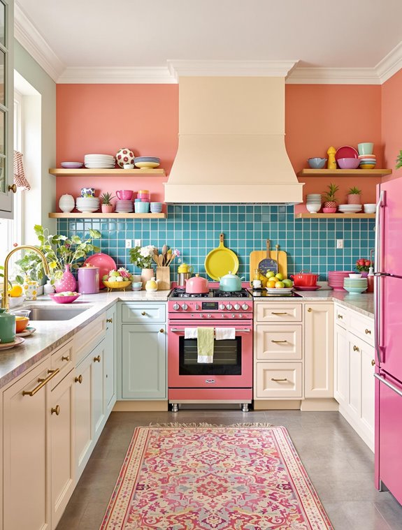
A strategic mix of color families, such as moss green with sky blue, introduces uniqueness and visual interest. Incorporating jewel tones like emerald green and ruby red adds an element of luxury and grandeur, while careful consideration of the room’s orientation and lighting guarantees these bold choices complement the overall design seamlessly.
Integrating Personal Style

Personalizing a kitchen design infuses character and individuality into the space, transforming it into a genuinely unique environment. Central to this personalization is the concept of cabinet customization, providing an opportunity to tailor cabinetry not only for functional needs but also to express personal style.
Homeowners can opt for colorful cabinets, such as vivid blues or nature-inspired hues like serene sage, to create an engaging visual impact. The use of open shelving in kitchen design allows homeowners to display their collections and seasonal items effectively, adding both functionality and decorative appeal.
Custom cabinetry can be further enhanced by integrating unique inserts in cabinet doors, such as glass or wood, offering a refined touch that reflects personal taste.
Incorporating decorative accents also plays a significant role in personalizing kitchen spaces. Elements like custom signs with family names or favorite quotes, crafted from materials such as wood or acrylic, can add a touch of warmth and individuality. Art pieces, whether commissioned paintings or framed family photos, bring a sense of personality and uniqueness. Custom backsplashes, designed with distinctive materials or patterns, contribute to a cohesive and personalized aesthetic.
In addition, selecting lighting fixtures and hardware that align with the overall style, such as rustic or modern, guarantees that each element harmonizes with the kitchen’s design, creating a cohesive and personalized environment.
Exploring Unexpected Combinations
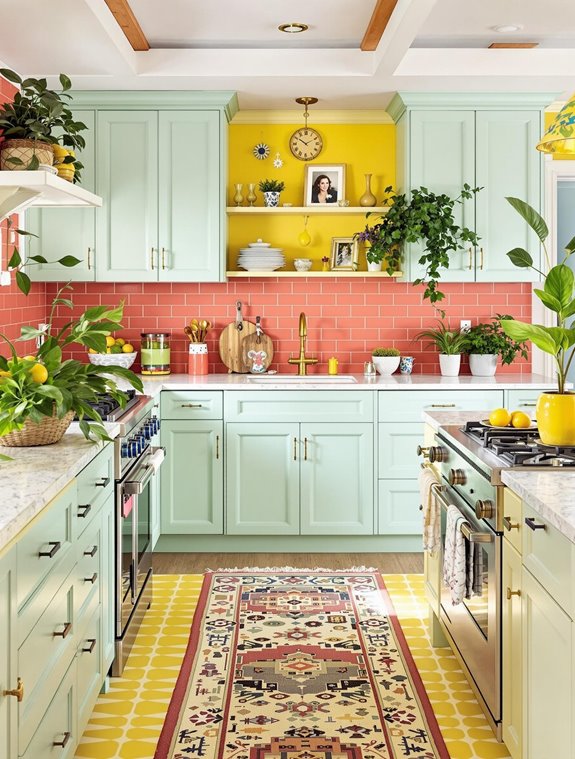
In kitchen design, exploring unexpected color combinations can dramatically transform a space, infusing it with character and originality. Incorporating unexpected pairings such as deep jewel tones alongside earthy terracotta can elevate a kitchen from conventional to extraordinary, creating a dynamic interplay of color contrasts. Kitchen cabinets serve as a great canvas for color experimentation, allowing homeowners to try bold combinations without overwhelming the entire space.
The use of bold accent walls in brilliant hues like raspberry blush or banana yellow introduces a playful energy, setting a striking backdrop against which more muted tones can be offset for a visually arresting effect.
Analogous combinations like green and blue present a serene yet unconventional choice, utilizing colors such as azure or cobalt paired with emerald or bottle green to establish a calming environment. These selections not only nurture tranquility but also connect the kitchen’s interior to the natural world, crafting a seamless indoor-outdoor aesthetic.
Further depth can be achieved by mixing tonal green schemes, like pairing forest green with sage, which adds dimension and texture.
For those seeking opulence, moody blues and midnight tones offer a sophisticated, statement-making ambiance, while metallic accents such as brass or gold provide a luxurious touch.
These unexpected pairings and color contrasts redefine traditional kitchen design, fostering a unique and personalized space.
Balancing Classic and Modern Tones
While unexpected color combinations can breathe life and energy into a kitchen, achieving a harmonious balance between classic and modern tones secures the space remains timeless and versatile.
Utilizing timeless neutrals, such as whites, creams, and grays, as a backdrop allows for seamless integration of contrasting accents that enhance both traditional and contemporary elements. For instance, natural stone countertops or subway tile backsplashes provide a classic foundation, beautifully complemented by sleek stainless steel appliances that inject a modern touch.
Incorporating shaker-style cabinets in classic hues like white or light gray further anchors the design, while integrating modern minimalist hardware, such as brushed nickel or polished chrome, introduces a contemporary edge. The emphasis on texture variety through these design choices not only adds depth but also elevates the overall visual appeal of the kitchen.
The inclusion of classic materials like marble or granite, paired with contemporary glass or metal accents, exemplifies the synthesis of eras, creating a kitchen that is both elegant and forward-thinking.
Lighting and flooring choices also contribute notably to this balance. A mix of recessed lighting, pendant lights, and under-cabinet illumination guarantees a layered lighting effect, while hardwood floors in rich tones, such as oak or walnut, provide a durable and classic foundation.
This strategic blending of elements secures a kitchen that is both enduring and stylish.
Frequently Asked Questions
How Do I Maintain Color Vibrancy in a High-Traffic Kitchen?
To prevent color fading in high-traffic kitchens, employ effective cleaning techniques. Regularly wipe surfaces with a soft, damp cloth and mild soap solution. Avoid harsh chemicals and maintain a consistent cleaning routine to preserve paint vibrancy.
What Are Durable Paint Options for Kitchen Walls?
When selecting durable paint options for kitchen walls, consider latex-based paints due to their eco-friendly properties. Evaluate texture considerations for ideal finish. Alternatives include water-based acrylics and low-VOC paints, prioritizing durability, washability, and moisture resistance.
How Can I Incorporate Metallic Accents Into My Kitchen Color Scheme?
Illuminate your kitchen’s elegance by weaving metallic finishes like brass and copper into the design fabric. These accents create striking color contrast, transforming mundane spaces into sophisticated culinary canvases that captivate both the eye and imagination.
Are There Specific Color Considerations for Kitchen Backsplashes?
When selecting kitchen backsplash colors, consider current color palette trends and the durability of backsplash materials. Choose hues that harmonize with existing design elements while ensuring ease of maintenance and compatibility with the kitchen’s lighting conditions.
How Do Color Choices Impact Kitchen Resale Value?
Color choices can dramatically influence kitchen resale value. Leveraging color psychology in alignment with resale trends is essential. Dark hues might deter potential buyers, while neutral tones generally enhance appeal, creating a broader market allure and faster sales.
Wrapping up
Incorporating color into kitchen design extends beyond the conventional confines of white and gray, offering opportunities to explore diverse palettes that enhance spatial perception and aesthetic appeal.
While some may argue that bold colors could overwhelm, strategic application—considering factors such as kitchen size, natural light, and personal style—ensures harmonious integration. By balancing classic and modern tones and experimenting with unexpected combinations, a kitchen can achieve a sophisticated equilibrium, reflecting both contemporary trends and timeless elegance.


